Dave Gibbons is a graphic artist that created the art for the Watchmen comic book. Dave Gibbons and Alan Moore collaborated on the creation of the Watchmen, a graphic novel that demonstrates how art and writing can be combined for the optimal reading experience.
Images like the one above demonstrate how Gibbons used the layout of the page, the size of the text boxes, and stylistic choices like color and perspective to aid in the understanding of the story.
Frank Lloyd Wright was an American architect, graphic designer, and writer. He designed 1,000 structures, 532 of which were completed. He is well-regarded as one of the best, most unique architects.
He opened his famous house and studio in Oak Park, Illinois.
Jennifer Packer paints intimate pictures of her friends, fellow artists, family members, lovers. She is interested in truth and authenticity in her paintings – she does not try to idealize anyone.
She is an assistant professor at the Rhode Island School of Design. She uses similar colors for paintings, making simple brush strokes, this blends the portraits and the background.
Jason Anderson is a UK based artist that has recently begun creating colorful landscapes using pixelated patches of pastel-toned oil paint. I chose these pieces because many of them in some way represent a city or a town, but the images are also very abstract like the one pictured below.
Each of his pieces are created on linen and centered around a focal point, normally one that is bright yellow to represent the sun or a train or a car. His career interestingly started doing stain glass restoration and claims that this style still influences his work as a painter.
In addition to painting abstract, Anderson also paints realistic portraits and nature scenes.
So, I found this artist when scrolling through a list of “10 Outstanding Abstract Artists to Watch in 2018.” Her name was towards the bottom of the list, but I was remarkably drawn by her use of colors to make completely abstract images that also have very powerful feelings behind. I also found it interesting because many of her paintings and drawings she titles simply with adjectives like “stoic” or “beauty” or “anger,” which I thought related to our project at hand.
Perera was born in Malaysia and defines herself as a “world traveler.” On her website she is defined as a “pure-life force.” It goes further to explain:
She is best at understanding the human condition, the human spirit. Perera has travelled far and met many people in her life. She has befriended the infirmed. Learned from death row inmates. Collaborated with fine artists across the globe. She treats each one as an equal.
She claims to have been born different and more sensitive, which allows her to understand the human condition. I’m not sure I believe any of that jazz, but I think her work is really beautiful and easy to stare at.
Wabi Sabi is a Japanese aesthetic and lifestyle that focuses on appreciating things that are transient and imperfect. The concept draws from Buddhism’s Three Marks of Existence, namely impermanence (annica), suffering (dukkha), and non-self (annata).
I first came across the concept of Wabi Sabi in a group chat with my roommates, one of which had taken a screenshot of a text her dad sent her. The text was a quote from Leonard Koren, an American artist, aesthetics expert, and writer of a book about Wabi Wabi aesthetics. The quote reads as follows:
Get rid of all that is unnecessary. Wabi-sabi means treading lightly on the planet and knowing how to appreciate whatever is encountered, no matter how trifling, whenever it is encountered. […] In other words, wabi-sabi tells us to stop our preoccupation with success–wealth, status, power, and luxury–and enjoy the unencumbered life. Obviously, leading the simple wabi-sabi life requires some effort and will and also some tough decisions. Wabi-sabi acknowledges that just as it is important to know when to make choices, it is also important to know when not to make choices: to let things be. Even at the most austere level of material existence, we still live in a world of things. Wabi-sabi is exactly about the delicate balance between the pleasure we get from things and the pleasure we get from freedom of things.”
Leonard Koren
In this quote, Koren relates Wabi Sabi back to a way of life, instructing everyone to let go of success and focus on balancing the things we have and the things we do not, while also finding beauty in that which is flawed and broken. But I digress, this quote is less important for our class and more important for my general consciousness, so I will move on.
In terms of design, Wabi Sabi finds a focus in “asymmetry, roughness, simplicity, economy, austerity, modesty, intimacy, and appreciation of the ingenuous integrity of natural objects and processes,” as according to the Wikipedia page.
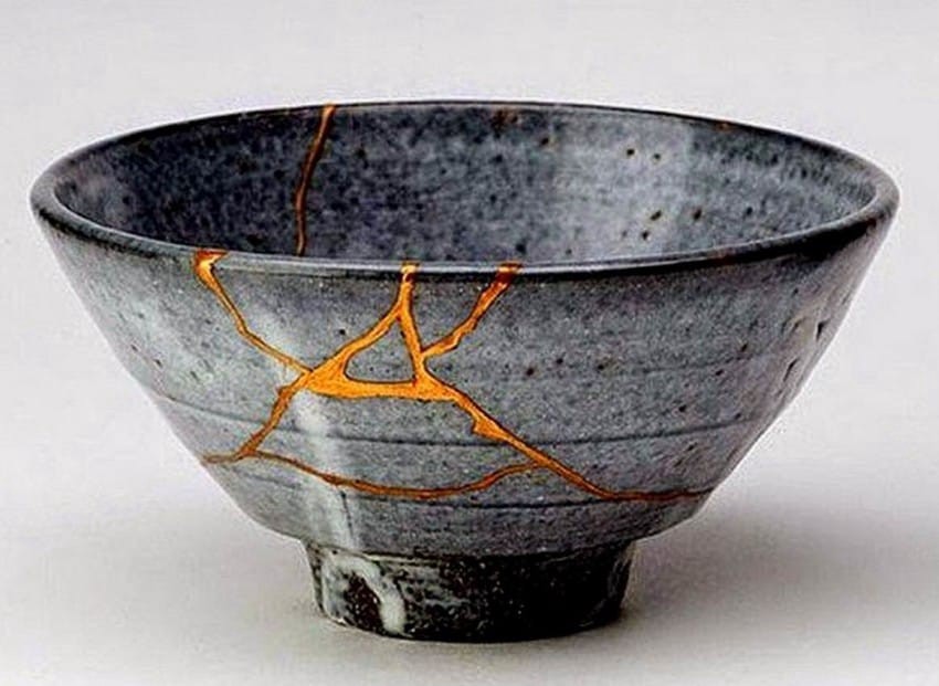
I chose to start with the bowl above to relate the philosophy of Wabi Sabi to physical objects. The image shows that the bowl shattered before being put back together with what looks like gold glue. This image perfectly demonstrates how the break in the bowl is actually what makes the bowl visually appealing. The life this bowl has lived, a life which eventually broke it, is apparent because of the gold glue used to revive it and that is what makes it beautiful.
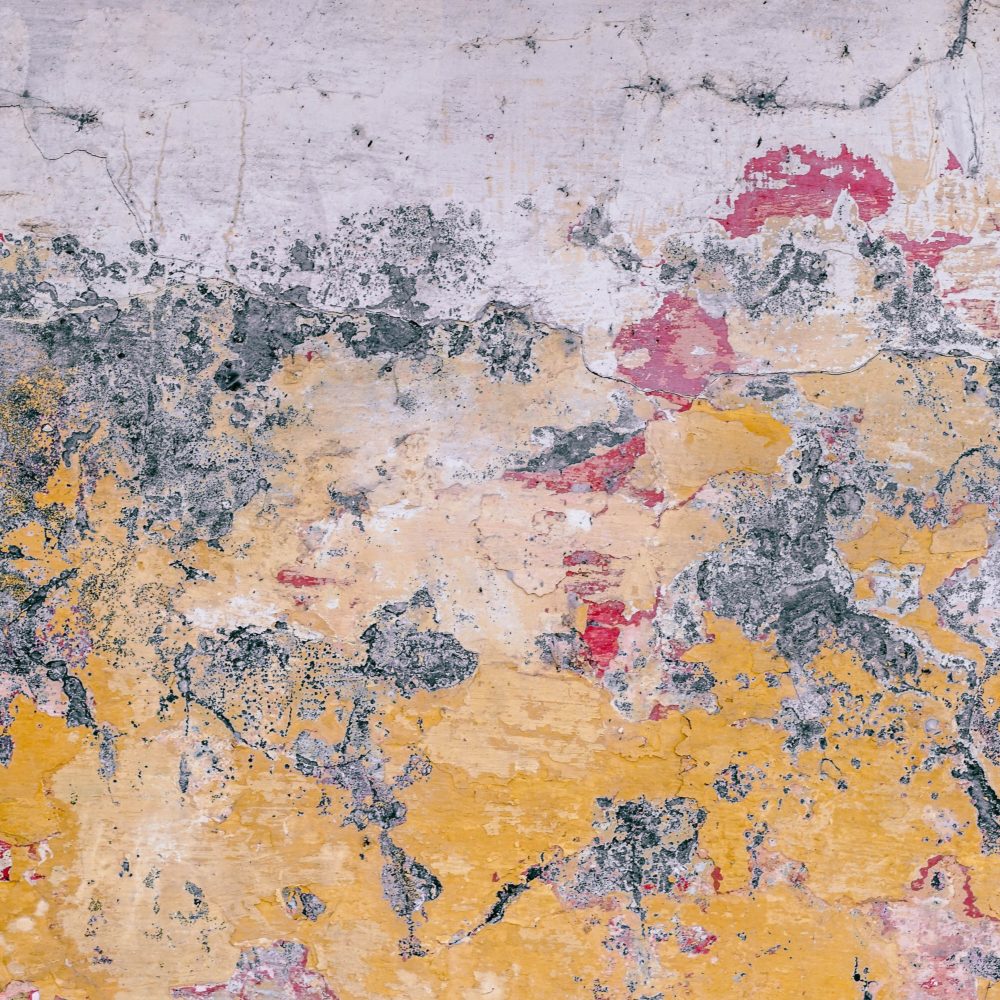
Above are three images, all of which are are dirty or broken, mundane or insignificant, and yet all three are beautiful. They are examples of the Wabi Sabi concept present in photography.
Above are two more examples of Wabi Sabi interior design and architecture. In the first, the exposed concrete wall, which is decomposing, broken, and almost archaic looking, accentuates the minimalistic design of the apartment and actually ties together room. Somehow, in that image, a piece of wall that people would normally take extreme measures to cover-up has been repurposed to look modern and edgy. In the image below, the design is similarly minimalistic, using predominately neutral colors and organic shapes.
Wabi Sabi is particularly interesting because in understanding the philosophy behind the phrase, the different images I used throughout this blog post actually all make a lot of sense together.
Paula Scher has been deemed one of the most influential graphic designers in the world. Described as a “master conjurer of the instantly familiar,” she works with pop culture, typography, and fine art. She was the first female principal at Pentagram, a famous design firm.
I chose her because I wanted to look at different and interesting approaches to typography, and more specifically, a woman working in the field. I found her book of maps particularly interesting and visually stimulating (shown below).
I think the use of white space, juxtaposed with the very busy map of the USA, works remarkably well. Here is another example of her work, not in the map series, but in a book titled: Make It Bigger
She teaches at the School of Visual Arts in New York City and has won over 300 awards from international design associations as well as a series of prizes from the American Institute of Graphic Design (AIGA), The Type Directors Club (NY), New York Art Directors Club and the Package Design Council.
Public Theater poster
She was also the first to designer to create an identity and familiar look for New York public theater, creating posters with energy and new uses of typography. Her goal was to promote attendance and awareness at the Public Theater, as well as bring in diverse groups of people. One of her posters is shown above.
Marian Bantjes is a designer, typographer, writer, and illustrator who works on a small island off the coast of Vancouver. She began her professional life first as a book typesetter, then co-founded and ran a design studio, before finally going off on her own as an artist.
Her work focuses on words, vectors, bright colors, and hand work. She published Book 1 Wonder in 2010 as an exploration of the relationship between words and image. The book was shortlisted for the British Design Book of the Year in 2011.
Her work pictured above, “Fire,” is the second wrapping paper design she created for Hemlock Printers in Vancouver. I chose it because it really caught my eye when first glancing at her portfolio, and when I clicked on it the piece it continued to keep me interested. I really appreciate the movement in the piece and the way the color concentration seems to switch seamlessly.