
Designed by Pentagram in a project led by principal graphic designer Paul Scher. It was originally designed for one location and was not known that Shake Shack was going to become a chain where these icons would be used everywhere.

Designed by Pentagram in a project led by principal graphic designer Paul Scher. It was originally designed for one location and was not known that Shake Shack was going to become a chain where these icons would be used everywhere.
Here’s a link to some parodies of IKEA instruction manuals. I just thought they were witty and would be good inspiration for 1.2.

Clyfford Still was an American painter whose work focused on the abstract. His work in the abstract predated some prominent abstract artists such as Pollock and Rothko, and is often cited as a pioneer who helped lead the art movement of Abstract Expressionism. One of the particular caveats of his work was his interest in edges and borders, as he noted that “It’s intolerable to be stopped by a frame’s edge.”
Still’s work continues to have influence in the modern day, and his paintings have been in exhibitions and museums around the world.


Keith Haring created iconic murals and chalk drawings in public spaces of New York City. He had a unique style that was minimalist in structure but complex in content.

André Derain was a French painter during the late 1800s and the early 1900s. He was a founding member of Fauvism, a movement that focused on the use of unnatural and expressionistic colors in otherwise representational paintings. He developed this movement alongside Henri Matisse, and their paintings were deemed by critics as “les fauves” (meaning the wild beasts) due to their vibrant and unusual use of color.
André Derain was most well known for his landscapes, portraits, and still lifes. He initially expressed these subjects through Fauvism. However, during the 1920s, he began to adopt a more muted color palette as a result of the influences of Cubism and Paul Cézanne.
Derain’s work ultimately symbolizes an interesting turn in art history, marking the shift from representational uses of color towards a more expressionistic use of color as seen in later movements.
For more information on Derain, click here.
Sign up here for this Sunday’s Intro to Photoshop tutorials.
I was thinking more about objects on Penn’s campus that have meaning to students, but not beyond that. The LOVE statue came to mind, as it has meaning in the greater Philadelphia area, but less meaning to the rest of the world. I found some interesting articles about the its history and the closeness that people from Philadelphia feel to it.

From the Philadelphia Encyclopedia, “the sculpture commonly known as “the LOVE statue,” first placed in Philadelphia’s John F. Kennedy Plaza for the 1976 Bicentennial, was not the only sculpture of its kind—by the twenty-first century, it was not even the only sculpture of its type in Philadelphia. Yet LOVE, by Robert Indiana (1928-2018), came to be embraced by Philadelphians and the city’s promoters as a distinctive icon for the City of Brotherly Love.”
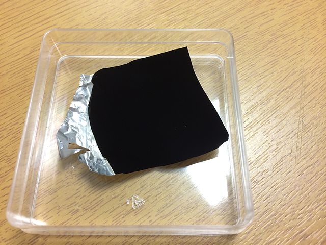
Vantablack is a material developed by Surrey NanoSystems in the United Kingdom and is one of the darkest substances known, absorbing up to 99.96% of visible light. The name is a compound of the acronym VANTA and the color black. Wikipedia
Vantablack is made of carbon nanotubes – rods of carbon that are much, much thinner than any human hair – packed so close together in a maze-like matrix that light goes in,
but can’t escape. businessinsider.com

I was introduced to Wade Guyton‘s unique style by Professor Comberg. I really enjoy not only the aesthetic nature of his prints, but also his idea behind it.

Guyton’s work focuses on printing, specifically the problems people face with printers. His relatable, minimalist work is pleasing to the eye, despite addressing issues that are commonly frustrating in everyday life.

In my opinion, the slight asymmetry makes you think, which I really enjoy and hope to do with my work in the future.

For Thursday please pin up your 10 x 10″ prints on the work space wall.
Post 1 translation of a sound and optionally 1 pattern.
We’ll give about 5 minutes feedback for each student.
After briefly browsing of the designs we will review each student’s work individually.
Everyone should participate in the critique, asking questions, making comments.
As we review and respond to work, rather than simply judging—“I like this” or “I’ve heard that this is good or bad”—I suggest that we ‘receive’ the work and question it. Approach the critique as a process of becoming familiar.
