Art Nouveau, also known as the Glasgow Style, was a movement popularized in the 1890s. Its primary goal was to modernize design and alleviate the disconnect between fine and applied art. As such, many pieces during this movement had real-world purpose; examples of popular applications of this art included posters and advertisements. This flowing art style also featured images drawn from nature such as plants, stems, and flower blossoms.
The style of the art itself drew heavily upon the unification of both organic and heavily graphic forms. The flow between these two forms was supported by the use of fluid lines–an aspect of the movement that overtook color in its importance. The reasoning behind this graphic yet simple approach was based off of the belief that earlier art was too ornamental. Thus, in response to what artists believed to be excessive ornamentation, Art Nouveau developed the core idea that function should dictate form. This belief ultimately made the movement become an important predecessor to modernism.
An example of a piece in the Art Nouveau style is shown above (a Job advertisement for cigarette papers created by Alphonse Mucha). Also, you can click here for more information on the Art Nouveau movement.
Marian Bantjes is a designer, typographer, writer, and illustrator who works on a small island off the coast of Vancouver. She began her professional life first as a book typesetter, then co-founded and ran a design studio, before finally going off on her own as an artist.
Her work focuses on words, vectors, bright colors, and hand work. She published Book 1 Wonder in 2010 as an exploration of the relationship between words and image. The book was shortlisted for the British Design Book of the Year in 2011.
Her work pictured above, “Fire,” is the second wrapping paper design she created for Hemlock Printers in Vancouver. I chose it because it really caught my eye when first glancing at her portfolio, and when I clicked on it the piece it continued to keep me interested. I really appreciate the movement in the piece and the way the color concentration seems to switch seamlessly.
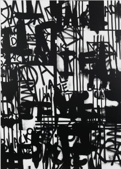
Round Composition: Top side of one of Weingart’s round compositons
Wolfgang Weingart, born in 1941, in the Salem Valley, Germany, is known to be a typographer, graphic designer, and theacher. In 1947, after Weingart started school, he noticed the academics weren’t a part of his stregnths. It was at this time that Weingart took a great interest in making things with his hands. After exploring his potential with his hands, he learned “that intellect can be expressed and cultivated through handwork”. He later moved to Lisbon in 1954, at the age of 13 and began his constant exposure to art and taking serious artistic classes. At the age of 17, after experiencing many mediums, Weingart still wasn’t sure about what he wanted to do for a career but felt that, overall, he was going in the right direction. At this time, he was at the Merz Academy in Stuttgart, Germany. His experience there led him to his enrollment at the Basel School of Design where he had gone to study typography. In later years, he experimented more with typography and began creating now-well-known projects such as “Round Compositions.” These were actually done because of and accident. He had dropped a drawer full of heavy type and when they scattered across the floor, instead of repacking them, he put them into a round cardboard ring. He did this in a random order and facing upwards. This gave him two printable sides, the top and the bottom. The bottom wasn’t actually intended to print, but, it gave him the opportunity to experiment even more. 1941, in the Salem Valley, GermanyWolfgang Weingart, born in is known to be a typographer, graphic designer, and theacher. In 1947, after Weingart started school, he noticed the academics weren’t a part of his stregnths. It was at this time that Weingart took a great interest in making things with his hands. After exploring his potential with his hands, he learned “that intellect can be expressed and cultivated through handwork”. He later moved to Lisbon in 1954, at the age of 13 and began his constant exposure to art and taking serious artistic classes. At the age of 17, after experiencing many mediums, Weingart still wasn’t sure about what he wanted to do for a career but felt that, overall, he was going in the right direction. At this time, he was at the Merz Academy in Stuttgart, Germany. His experience there led him to his enrollment at the Basel School of Design where he had gone to study typography. In later years, he experimented more with typography and began creating now-well-known projects such as “Round Compositions.” These were actually done because of and accident. He had dropped a drawer full of heavy type and when they scattered across the floor, instead of repacking them, he put them into a round cardboard ring. He did this in a random order and facing upwards. This gave him two printable sides, the top and the bottom. The bottom wasn’t actually intended to print, but, it gave him the opportunity to experiment even more.
Alexander Calder (1898-1976) loved engineering, sunsets, and circuses. He was an avant-garde sculptor committed to representing form, mass, and movement.
What was his most notable legacy? Probably creating what his french pal Marcel Duchamp dubbed “mobiles” for their motion. Mobiles are a form of kinetic sculpture that hang in a balance from rods. In his creations, Calder’s motion was both abstract and literal – human eyes jump around just looking at Calder’s work. Even when it’s two-dimensional, the shapes and lines jump around. Calder also helped invent performance art by physically moving his sculptures around in Cirque Calder.
Calder was an innovator and an experimenter who made his life’s work a balancing act.
Victor Vasarely was a French-Hungarian artist born in Hungary in 1906. In 1928/29 he abandoned medical school and enrolled in an art school that concentrated on graphic design and topographical design. He moved to France in 1930 and began his career as a graphic artist. Despite leaving behind his medical studies, his interest in science continued to influence the style and content of his work, which is often geometric and abstract. Later in life, he began creating sculptures in addition to his artwork. Vasarely passed away in France in 1997. Today, he is regarded as the grandfather of op art, short for optical art. This type of art uses optical illusions, giving the observer the impression of movement, vibrating patterns, or warping. Often times, op art is created in black-and-white, although some of Vasarely’s works include color. To see more of his work, click here.
A colleague of the renowned Emil Ruder and successor as the head of the graphic design department at the Basel School of Design, Armin Hofmann’s work relies heavily on the fundamentals of graphics: lines and dots. Hofmann’s posters are especially of note, as he avoided the use of color in favor of black and white. They often incorporate clean shapes that bleed into one another, such that a subtle semblance of other letters can form in the spaces between regular letters. In the 1950s, he was a key figure in efforts to develop Swiss Style, or International Typographic Style. This graphic design style emphasized readability, asymmetric alignment, and cleanliness through a grid-based text layout. To this day, Hofmann’s posters and his work in International Typographic Style continue to influence and inspire architects and designers alike.
Click on Write in upper right part of window
Or click on My Sites > Posts > Add New Post
USE CLASSIC EDITOR to edit
Write title, text, add images, links
Click on Preview and check post
If OK, click Publish
There are lots of ‘How to create a new post WordPress’ videos if you need help
Our Illustrator tutorial is scheduled for September 8.
In the meantime here are a number of tutorials that may be helpful — those in bold are especially relevant.
To create a repeating pattern and some digital texture, check this guide.


