Climate change activists took to the field during halftime of the football game between Harvard and Yale.


Climate change activists took to the field during halftime of the football game between Harvard and Yale.


Portfolios of semester work are due before noon, Thursday, December 19.
Post to Course Folder>Portfolios
Create a series of landscape, letter (11×8.5″) pages – 3-4 pages per project, 1″ border, documenting preliminary and final designs for each project. Save as a Smallest File Size PDF and title as name.portfolio.pdf. Do not print.
For projects 2 and 4, include storyboards, sketches, stills, and links to videos posted on YouTube, Vimeo, etc.
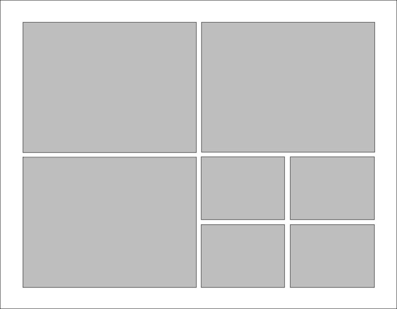
Structure each page in an ordered, ‘interesting’ manner (using a grid, like below) to make a cohesive 15-20 page record of your work. For the data project include a brief statement identifying your data. For the final project include a short statement explaining the work, still photos, and link to video.
Host Project 4 videos on YouTube or Vimeo and post link on blog, including a title, team members, and short explanation, like this.

Here are some sample portfolios from previous Foundations classes.
konhee-changportfolio
samsherman-portfolio
ricardohernandez_portfolio
Many artists have taken to incorporating data or statistics into their art. David McCandless is one of them. The British data journalist founded the blog Information is Beautiful as well as published two infographic books. The blog takes data from society and “distills” it to create colorful visualizations. McCandless says that one of his goals is to expose hidden patterns within data about the world we live in.

On top of Information is Beautiful, McCandless has another website called Beautiful News. It seeks to put a new spin on the mundane consumption of news. The stories on the blog are almost all positive and they come with lovely pieces of digital artwork.
While doing some research on the web for our Project 4, I was inspired by a social kindness experiment. It’s a 2 minute video, in which strangers give roses to other strangers. The idea is not so unique but the video quality is on point. I like the use of sound mixed with voice over recordings and the added reflections about the experiment. Video’s message is delivered very clearly and effectively.
On December 14, 1989, sculptor Arturo Di Modica illegally placed a massive, 7100 pound bronze sculpture of a bull poised to charge in the Financial District of Manhattan. The NYPD would impound it shortly later that day, but a wave of public outcry persuaded officials to bring the bull back.
Di Modica intended the bull to inspire, as he considered it a gift to America for helping to fulfill his dream of becoming a sculpture. However, it has taken on other connotations as well, as some movements paint it as a kind of emblem of corporate greed. For example, the Occupy Wall Street movement created posters depicting the bull as an antagonistic force. Regardless, it has become a huge tourist attraction in the Financial District.

To complete project 3, compose a summary page (Landscape, Tabloid) with an image of your Processing code (or a sample if not the entire code), the visualization produced by the code, your data source, an example of what you did in Illustrator (if applicable), and a large photo of your wearable from our critique. Save as PDF to Course Folder and print one copy tabloid on the Phaser.


Here is the description of Design Practicum, a class I’m teaching next semester, and the list of Integrative Design Studios offered in the spring. Please see me if you have any questions.
Practicum Flyer 2020
Integrative Design Studios
